Why Short Films Need Real Posters (Not Just Stills)
Short films are getting overlooked, for a simple reason...they don't look worthy of your time to view. The best film posters are carefully designed. The higher the production value in your poster, the more viewers attracted. Still Photography Is Not A Movie Poster.
3 min read
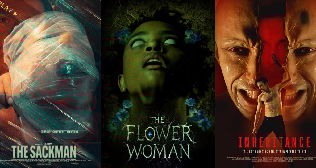
In the world of short films, marketing is often treated as an afterthought. Budgets are tight, timelines are rushed, and promotion frequently boils down to one solution: grabbing a frame from the film, slapping on a title, and calling it a poster. While this approach is understandable, it’s also a missed opportunity.
Short films need real posters—designed with intention, concept, and audience in mind—just as much as feature films do. In many cases, they need them even more.
A Poster Is Not a Screenshot
A still image is documentation. A poster is communication.
A film still captures a moment inside the story. A poster exists outside the film—it’s a promise, an invitation, and often the very first point of contact an audience has with the work. When a still is repurposed as a poster, it’s forced to do a job it wasn’t designed for.
Cinematography prioritizes mood, realism, and continuity. Poster design prioritizes clarity, impact, and curiosity. These goals overlap, but they are not the same.
A strong poster doesn’t ask, “What does this frame look like?” It asks, “Why should someone stop scrolling and care?”
Shorts Have Less Time—So the Poster Has to Work Harder
Feature films benefit from star power, trailers, press cycles, and wider distribution. Short films rarely have these luxuries. Often, the poster appears:
As a tiny thumbnail on a festival page
In a fast-moving social media feed
On a crowded screening lineup
In a programmer’s inbox alongside dozens of other submissions
In these contexts, the poster may have only seconds—or less—to register.
A random still can be visually beautiful and still fail completely at this task. A poster designed from the ground up can distill tone, genre, and theme into a single, legible image that reads instantly.
A Poster Signals Professionalism
Like it or not, presentation shapes perception.
A thoughtfully designed poster signals that the filmmaker understands their project as a film, not just an exercise or experiment. It suggests care, confidence, and intentionality. Programmers, collaborators, and audiences subconsciously read this.
When a short film relies on a low-effort still, it can unintentionally communicate:
This project is unfinished
Marketing wasn’t considered
The film may not know what it is
None of these may be true—but perception often matters as much as reality.
Posters Clarify Tone in a Way Stills Often Can’t
Many short films live in tonal gray areas: horror-comedy, surreal drama, quiet sci‑fi, restrained thriller. A still from the film may not clearly express this balance.
A poster can.
Through typography, color, composition, and negative space, a poster can tell an audience:
This is playful, not deadly serious
This is horror, but intimate
This is surreal, not literal
A still simply reflects what the camera captured. A poster interprets the film’s identity.
Marketing Is Part of the Art, Not Separate From It
For short filmmakers especially, the poster is often the most widely seen expression of the film. In many cases, more people will see the poster than will ever see the short itself.
That makes poster design a creative act—not a marketing chore.
Some of the most memorable short films are remembered as much for their imagery and graphic identity as for their narratives. The poster becomes part of the film’s life, circulating long after festival screenings end.
Treating the poster as an extension of the film allows the work to exist more fully in the world.
A Poster Doesn’t Have to Be Expensive—Just Intentional
Producing a real poster does not require a large budget. It requires:
A clear understanding of the film’s core idea
A willingness to step outside literal imagery
Collaboration with a designer or design-minded collaborator
Even minimalist posters—typography-forward designs, symbolic imagery, or graphic abstraction—can outperform stills when they are conceptually strong.
The goal isn’t complexity. It’s clarity.
Conclusion: The Poster Is the Film’s First Scene
For short films, the poster often is the opening scene—the moment where the audience decides whether to lean in or move on.
Using a still image is easy. Designing a poster is deliberate.
And in a landscape where attention is scarce and competition is high, deliberateness matters.
Short films deserve posters that don’t just show what the film looks like—but express what it feels like. Check out indie poster gallery on https://www.filmindependent.org
To view some view here: https://bigpictureco.net/independent-film-posters-portfolio
Or check out this quick video: <iframe width="560" height="315" src="https://www.youtube.com/embed/bO-7kgf-3Oc?si=9hFU2iuGbwsrkw_V" title="YouTube video player" frameborder="0" allow="accelerometer; autoplay; clipboard-write; encrypted-media; gyroscope; picture-in-picture; web-share" referrerpolicy="strict-origin-when-cross-origin" allowfullscreen></iframe>