Not Your Type
The Importance Of Typography In An Indy Film Poster
8/14/20251 min read


Typography is crucial in movie poster design as it significantly impacts how a film is perceived, influencing its mood, genre, and overall message. Well-chosen fonts can evoke emotions, convey tone, and guide the viewer's eye, making the poster more memorable and engaging.
Here's why typography is so important:
Sets the tone and mood:
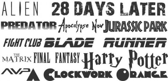
Different fonts can evoke a wide range of emotions. For example, bold, sans-serif fonts might be used for action films to convey power and excitement, while elegant script fonts could be used for romance films to suggest sophistication and tenderness.
Conveys genre:
The font choice can quickly signal the genre of the movie, helping audiences understand what to expect.
Enhances readability and clarity:
Choosing clear, legible fonts is essential for conveying information like the title, cast, and release date, ensuring that the poster is easily understood from a distance.
Creates visual hierarchy:
Different font sizes, weights, and styles can be used to prioritize information, guiding the viewer's attention and making the poster more visually appealing.
Strengthens branding:
Distinctive fonts can become associated with a movie franchise, creating a strong visual identity that resonates with audiences.
Adds an artistic element:
Creative typography can elevate the poster from simple information delivery to an art form, making it more eye-catching and memorable.
