Movie Poster Masterclass: Independent Movie Horror Poster Design for Independent Film Festivals
The Dos and Don'ts of Creating Key Art That Gets Noticed. Independent Movie Horror Poster Design for film festivals. Real movie poster designer vs templates and AI
7/14/20266 min read
DON'T Show the Entire Movie
One of the biggest mistakes independent filmmakers make is trying to fit every important scene, character, weapon, monster, and location onto one poster.
A movie poster isn't a highlight reel.
Its job isn't to summarize your story.
Its job is to persuade someone to watch it.
Some of the most memorable horror movie posters in history reveal very little. Instead, they establish tone, mood, and emotional tension.
Resist the temptation to explain everything. Let your audience discover the story when they press play.
DO Use Typography as Part of the Story
Typography isn't decoration.
It's acting.
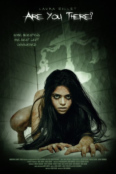
A carefully crafted title treatment immediately communicates whether your film is supernatural, psychological, vintage, modern, or grounded in realism.
Letter spacing | Texture | Scale | Hierarchy | Font Choice (and is it over used, or an homage)
Every design decision influences how audiences subconsciously perceive your film before they've watched a single frame.
Typography should never compete with the artwork. It should complete it.
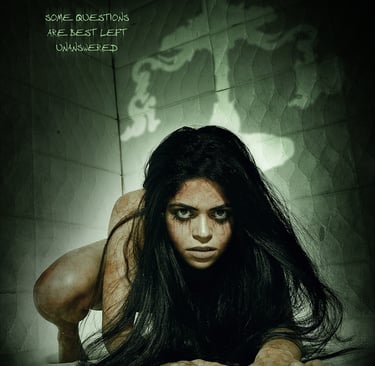
Welcome to the Big Picture Company Movie Poster Masterclass, a series created to help independent filmmakers understand the art and strategy behind professional movie poster design.
After more than 20 years creating entertainment marketing campaigns, key art, and movie posters for film studios, distributors, and independent filmmakers—and earning multiple Clio Awards along the way—I've learned that a successful movie poster is never just about making something look beautiful.
It's about marketing.
It's about storytelling.
And it's about creating an emotional connection before an audience ever watches a trailer.
Today's filmmakers have access to countless design tools. With platforms like Canva, Adobe Express, and AI image generators, anyone can assemble a poster in a matter of minutes. But while those tools can produce an image, they can't replace creative direction, strategic thinking, or years of experience understanding what captures attention in an increasingly crowded marketplace.
A professional movie poster isn't built from a template.
It's built from a deep understanding of composition, typography, visual hierarchy, audience psychology, and the unique story your film is trying to tell.
That's the difference between decoration and key art.
Throughout this Masterclass, I'll break down the creative decisions behind effective horror movie poster design, explain the common mistakes that prevent independent films from standing out at festivals, and share examples from real-world projects to illustrate why thoughtful design remains one of the most powerful marketing tools an independent filmmaker can invest in.
Whether you're preparing for your first film festival, pitching distributors, or planning your streaming release, these principles will help you create artwork that represents your film with confidence and originality.
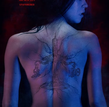
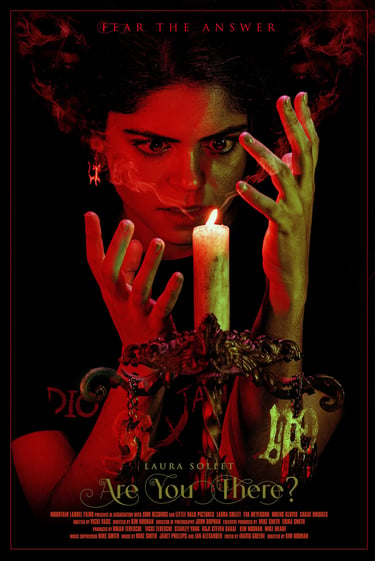
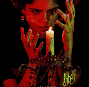
DO Create Curiosity, Not Confusion
The strongest horror posters invite viewers into the mystery. They hint at danger without revealing every answer. They encourage audiences to ask questions instead of immediately explaining the plot.
A poster should make someone stop and think and feel:
"What happened here?"
"Who is that?"
"Why does this feel unsettling?"
Curiosity is one of the most powerful marketing tools in horror. Often, the imagination is far more frightening than anything shown outright.
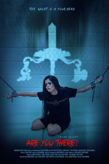
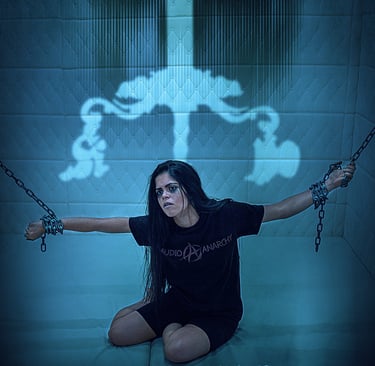
DON'T Show the Entire Movie
One of the biggest mistakes independent filmmakers make is trying to fit every important scene, character, weapon, monster, and location onto one poster.
A movie poster isn't a highlight reel.
Its job isn't to summarize your story.
Its job is to persuade someone to watch it.
Some of the most memorable horror movie posters in history reveal very little. Instead, they establish tone, mood, and emotional tension.
Resist the temptation to explain everything. Let your audience discover the story when they press play.
DON'T Settle for a Template
It's never been easier to build a movie poster using Canva, Adobe Express, or an AI image generator. Unfortunately, it's also never been easier for independent films to look exactly alike. Templates are designed to solve general design problems for thousands of users. A professional movie poster solves one very specific problem:
How do we make your film impossible to ignore?
Film festivals receive hundreds—sometimes thousands—of submissions. Distributors review countless projects every year. When your artwork resembles a template that's been used hundreds of times, it's harder to establish a memorable visual identity. Professional key art isn't about making something "pretty."
It's about communicating your film's personality in a way that no template ever could.
AI Can Generate Images. It Can't Develop a Marketing Strategy.
Artificial intelligence is becoming an incredible production tool, but it isn't a Creative Director.
AI doesn't understand your audience. It doesn't know what emotional promise your poster should make.
It doesn't recognize the subtle differences between psychological horror, elevated horror, supernatural horror, slashers, creature features, or folk horror.
It can generate pixels. It cannot replace decades of experience solving creative marketing problems.
When I begin designing a poster, I'm not asking:
"What looks cool?"
I'm asking:
Who is this audience?
What emotion should they feel first?
What should remain a mystery?
What visual elements best communicate this story?
How will this artwork perform as a festival poster, streaming thumbnail, social media campaign, and theatrical one-sheet?
That's creative direction.
That's strategy.
And that's something automation simply cannot replicate.
Great Composition Creates Great Marketing
Every successful movie poster begins with composition.
Where does the viewer's eye travel first?
What creates tension?
Where does negative space build suspense?
How does color guide emotion?
Should the villain dominate the frame—or remain hidden?
These decisions aren't accidental.
They're the result of years of studying visual storytelling, entertainment marketing, and audience psychology.
A successful horror poster isn't just beautiful.
It's persuasive.
Every Film Deserves Its Own Visual Identity
Independent films already face enormous challenges competing for attention.
Your movie poster should never feel generic.
Whether your project is a psychological thriller, supernatural horror film, slasher, creature feature, or elevated horror story, your artwork should reflect what makes your film unique.
That's why every project I take on begins with understanding the story before designing the artwork.
The goal isn't simply to create a poster.
The goal is to create a visual identity that helps audiences remember your film long after they've walked past it.
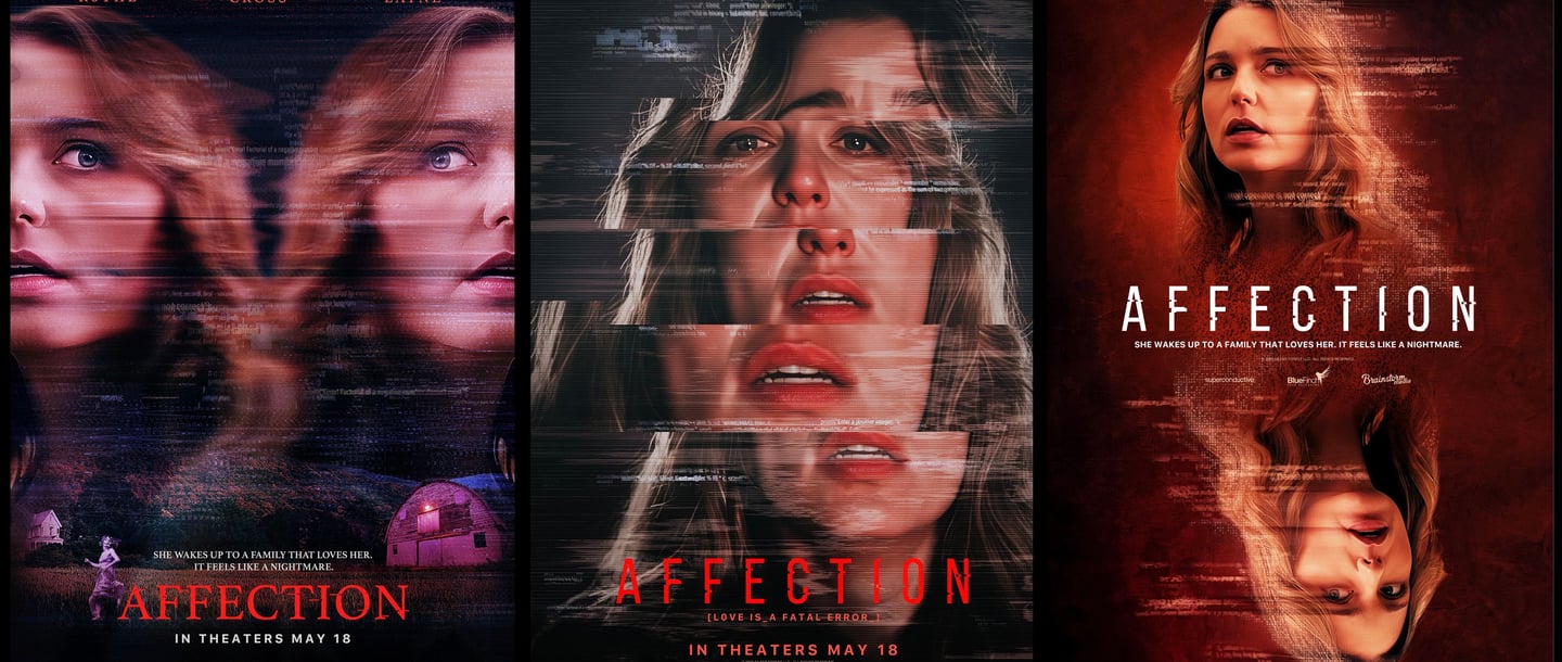
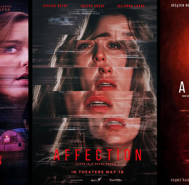
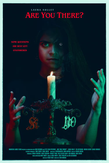
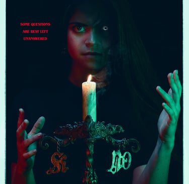
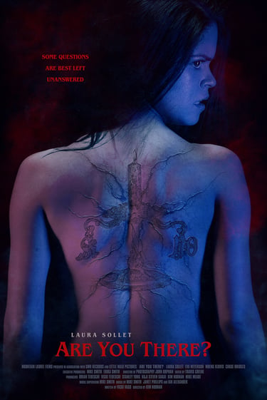
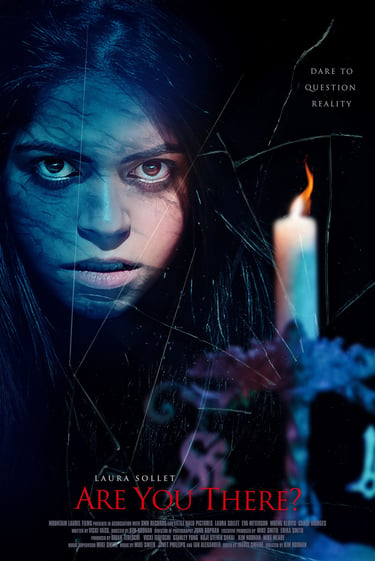
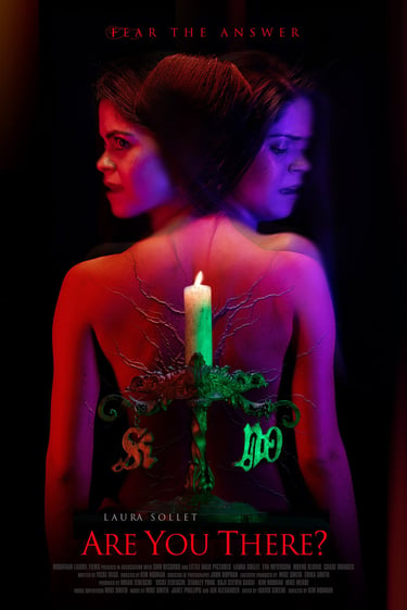
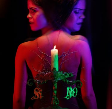
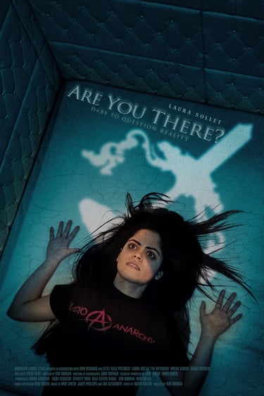
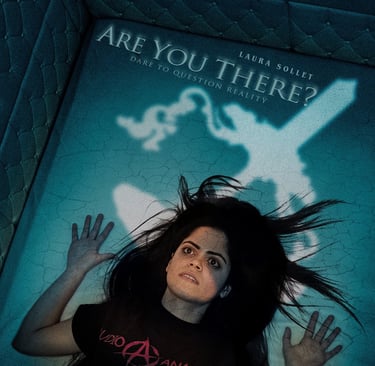
All images in this blog are for One Film, but with Different Marketing Strategies.
You may have noticed something unusual throughout this Masterclass.
Every poster featured above was created for the same independent horror film.
So why design so many different posters?
Because creating effective key art isn't about finding the first image that works—it's about exploring multiple creative directions to discover which concept best communicates the film's story, tone, and audience appeal.
A horror film can be marketed in many different ways.
One concept might emphasize psychological suspense through restrained composition and minimal typography.
Another might focus on the lead actor making direct eye contact with the audience, creating an immediate emotional connection.
A third might rely on bold color, dramatic lighting, or a more provocative visual approach to capture attention in a crowded festival program or streaming platform.
Each direction tells a slightly different story before a single frame of the film is ever seen.
This exploration is a fundamental part of the creative process. Rather than settling for the first idea, professional key art development considers composition, typography, color, visual hierarchy, and audience expectations before selecting the strongest concept.
That's one of the biggest differences between custom movie poster design and template-based solutions.
Templates begin with a predetermined layout.
Professional creative direction begins with your film.
The goal isn't simply to design a beautiful poster—it's to discover the visual identity that gives your film its strongest opportunity to connect with audiences, stand out at film festivals, and support its marketing long after production has wrapped.
Final Thoughts
Your movie poster is often the first conversation your film has with its audience.
Long before anyone watches your trailer, reads your synopsis, or buys a ticket, they'll make assumptions based on your key art.
As someone who has spent more than two decades creating entertainment marketing campaigns for film studios and independent productions alike, I believe every film deserves artwork that's crafted with purpose—not assembled from templates or generated without creative direction.
A professionally designed poster doesn't just represent your film.
It helps market it.
If you're preparing your horror film for festivals, distribution, or streaming, investing in original key art is one of the most valuable creative decisions you can make.
Because in horror, as in all great filmmaking, the first impression should be unforgettable.