Independent Horror Movie Poster Design Masterclass: Psychological Horror vs. Slasher Posters
Understanding the visual language behind creating successful independent horror poster design. Indie horror poster designer breaks down the process to a successful horror movie poster. (with independent horror poster examples)
8/29/20265 min read
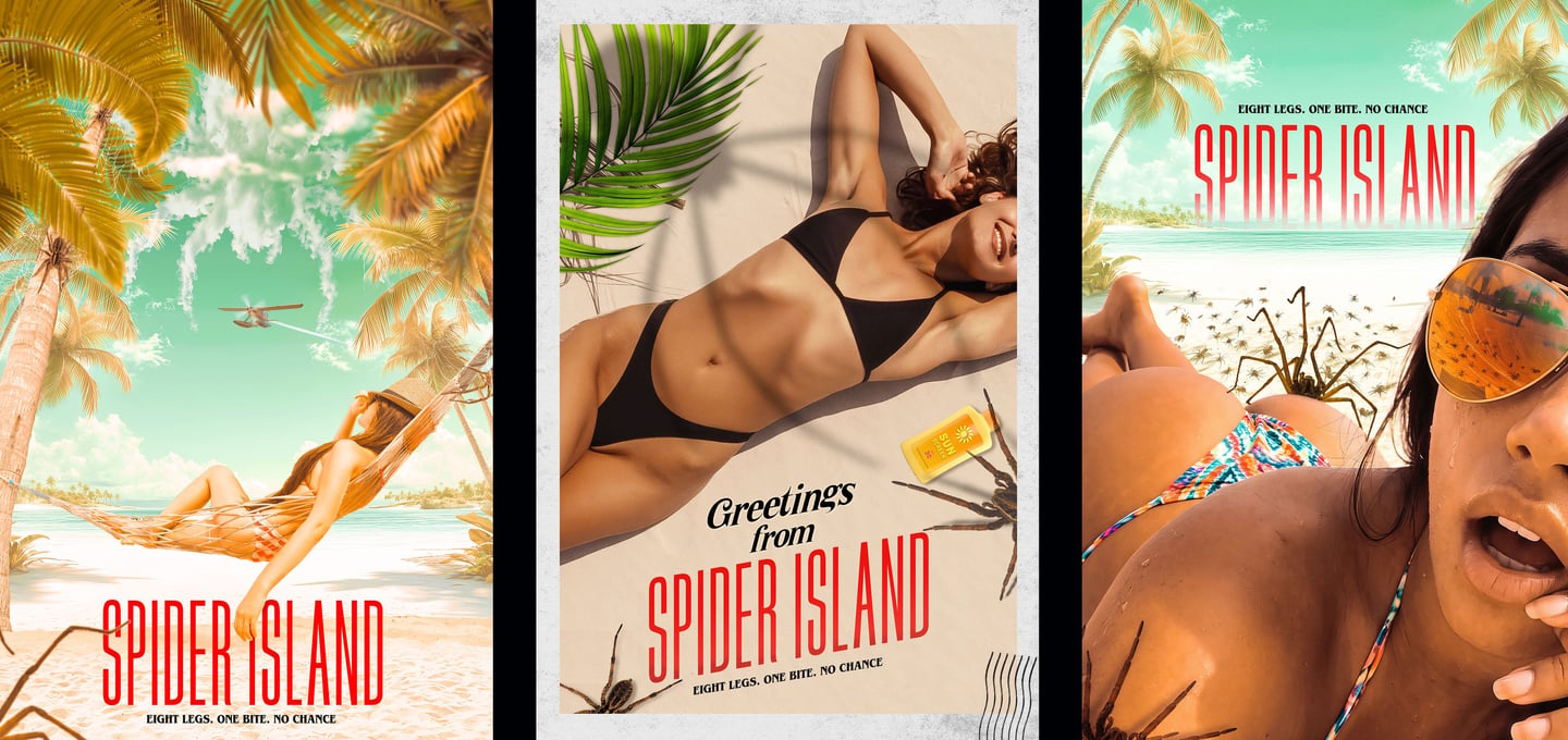
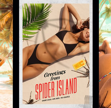
Every independent horror film has one thing in common: it has only a few seconds to convince someone to stop scrolling.
Whether a viewer discovers your film on a streaming service, at a film festival, on social media, or through a distributor's catalog, your movie poster is almost always their first impression. Great independent horror movie poster design isn't about creating the scariest image possible—it's about communicating the right kind of fear to the right audience.
After more than two decades designing entertainment advertising, I've learned that horror isn't one genre from a marketing perspective. A psychological thriller shouldn't look like a slasher. A surreal nightmare shouldn't be marketed like a creature feature. Every subgenre speaks a different visual language, and understanding those differences is what transforms a poster from artwork into effective key art.
The First Rule of Independent Horror Movie Poster Design
Before opening Photoshop or sketching concepts, I ask one question:
What emotion should the audience feel before they ever watch the trailer?
That answer influences every creative decision that follows—from photography and typography to composition, lighting, texture, and color.
The goal isn't simply to design a beautiful horror poster. The goal is to attract the audience most likely to love your film. A horror film poster design should draw the viewer in and condense and tease the 2 hour films into one, powerful design that connects with the viewer on an emotional level. To Frighten. Disgust. Thrill. Spook and Grab the viewer and not let go.
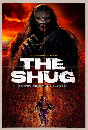
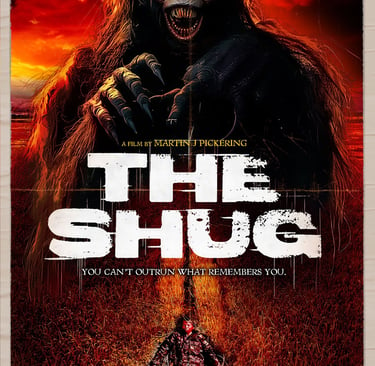
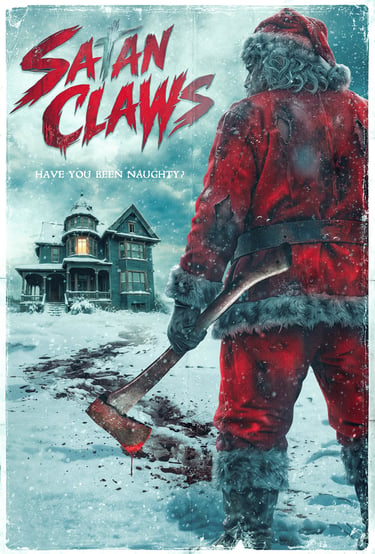
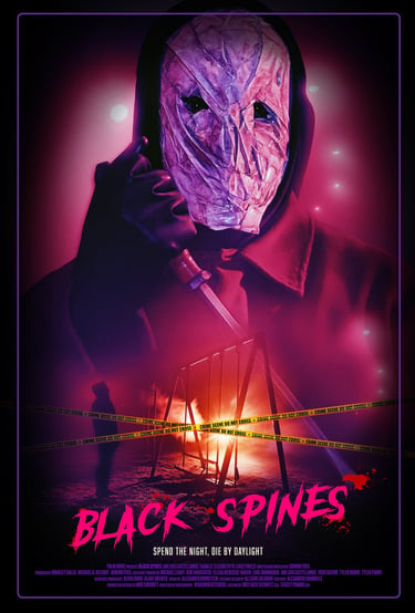
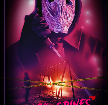
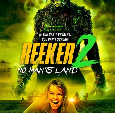
Slasher Posters: Selling Suspense and Survival
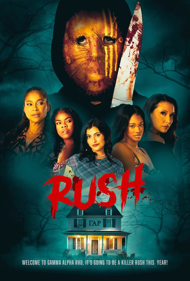
Slasher audiences arrive expecting momentum. The threat is immediate. The danger is visible. The violence, undeniable...Jump-scares and gore galore!
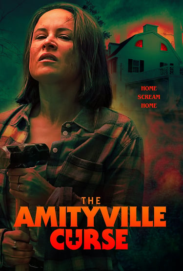
While mystery still matters, slasher marketing generally benefits from stronger visual contrast, dynamic compositions, recognizable silhouettes, dramatic lighting, and imagery that promises confrontation.
That doesn't mean every poster requires blood or a weapon front and center. Some of the most memorable slasher campaigns build anticipation by revealing just enough to let the audience imagine what's waiting beyond the frame.
The best slasher posters balance excitement with restraint.
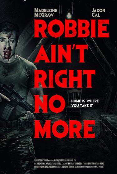
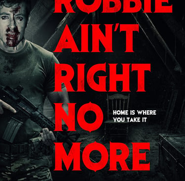
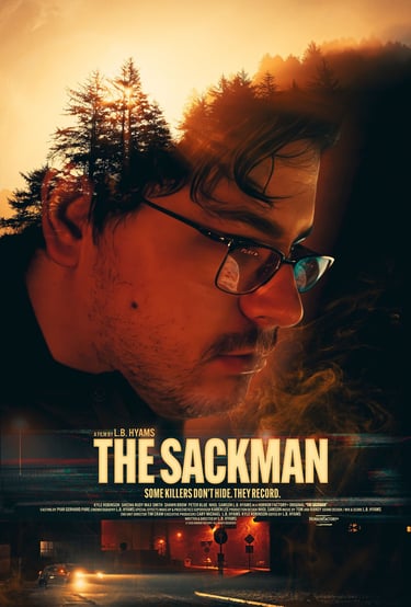
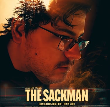
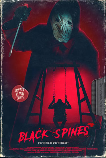
Psychological Horror: Fear That Lives in the Mind
Psychological horror isn't sold through gore. It's sold through uncertainty.
These films explore paranoia, grief, obsession, isolation, guilt, trauma, and the slow collapse of reality. The audience enjoys solving mysteries and interpreting symbolism, so the poster should invite curiosity rather than reveal every answer.
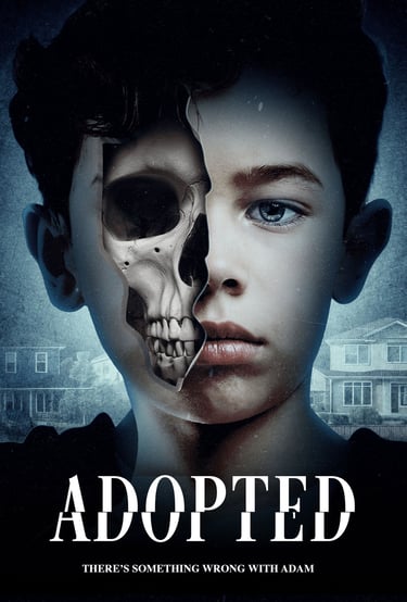
Negative space, restrained typography, subtle symbolism, and carefully controlled color palettes often create far more tension than graphic imagery. Sometimes the most unsettling image is the one that allows the viewer's imagination to complete the story.
Supernatural Horror: Elegant Fear & Gothic Atmosphere
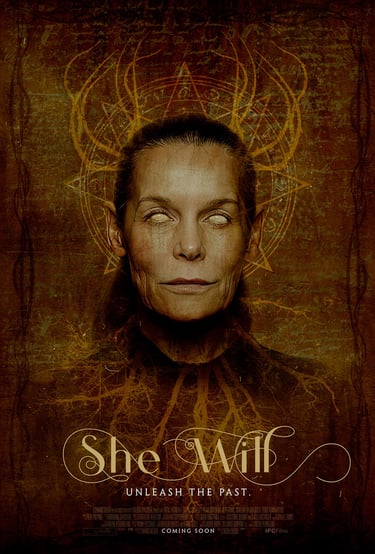
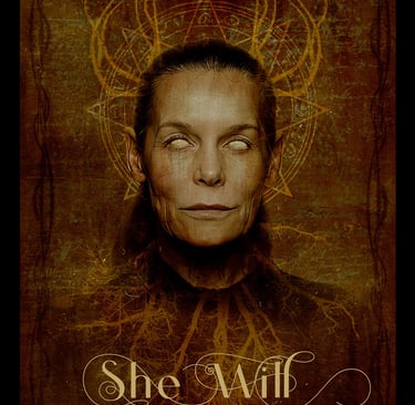
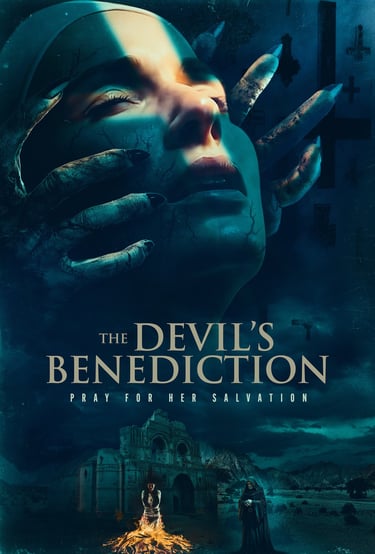
Supernatural horror occupies a very different space than slashers or graphic horror. These films rely on atmosphere, folklore, haunted locations, possession, ancient rituals, and forces that exist just beyond human understanding.
The marketing should reflect that same sense of mystery.
Rather than relying on graphic imagery, supernatural horror posters often succeed through elegant composition, dramatic lighting, subtle symbolism, and carefully restrained color palettes. Gothic architecture, religious iconography, mist, candlelight, weathered textures, and isolated figures can communicate far more than showing the threat outright.
The objective is to create an emotional chill rather than a physical shock.
Some of the most memorable supernatural horror posters leave viewers with an uneasy feeling they can't quite explain. They invite the audience to wonder what unseen force is lurking just outside the frame.
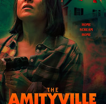
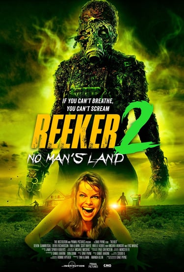
Grindhouse Horror: Bold, Graphic, and Unapologetic
At the opposite end of the spectrum is grindhouse horror.
These films celebrate excess. Blood flies. Bodies fall.
The violence is exaggerated, outrageous, and often delivered with a knowing sense of style that horror fans immediately recognize.
A grindhouse poster shouldn't apologize for what it is—it should embrace it.
Graphic typography, saturated color, distressed textures, dynamic compositions, practical effects, outrageous villains, and unapologetic visual energy all become part of the marketing language. These posters borrow inspiration from exploitation cinema, vintage drive-in advertising, VHS box art, and cult movie campaigns that promised audiences an unforgettable night.
The challenge isn't simply making the artwork graphic.
It's balancing shock with craftsmanship so the design feels intentional rather than chaotic. Even the wildest grindhouse poster benefits from strong composition, hierarchy, and a clear focal point.
For independent horror filmmakers, authenticity is everything. Genre fans immediately recognize when artwork understands the traditions of grindhouse cinema versus when it's simply trying to imitate them.
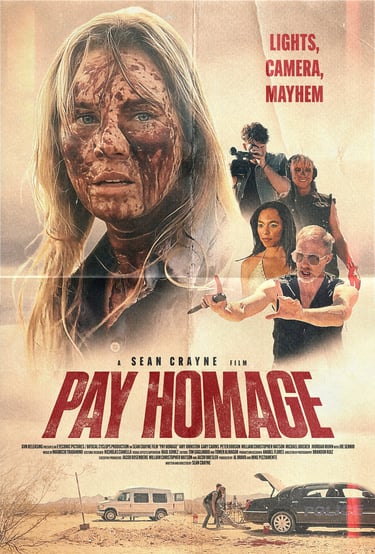
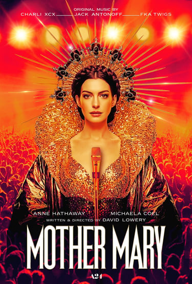
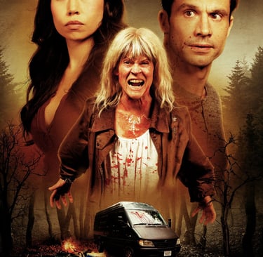
Surreal Horror: Breaking the Rules of Reality
Some of my favorite independent horror films refuse to fit neatly into a category.
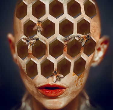
Surreal horror embraces dream logic, symbolism, distorted perspectives, impossible environments, and imagery that lingers long after you've looked away.
Designing these posters requires resisting the urge to explain everything.
Instead, the artwork should leave viewers asking questions.
That uncertainty becomes part of the marketing.
For independent filmmakers creating elevated, experimental, or arthouse horror, surreal key art often becomes one of the strongest tools for standing apart in a crowded marketplace.
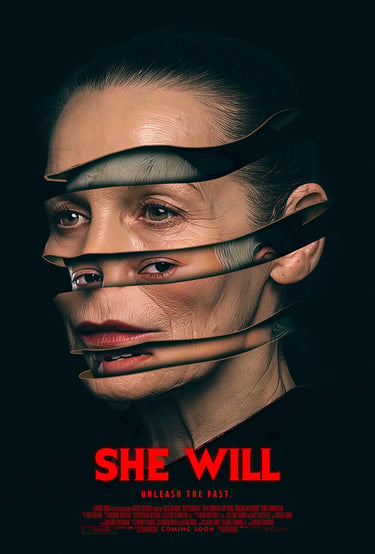
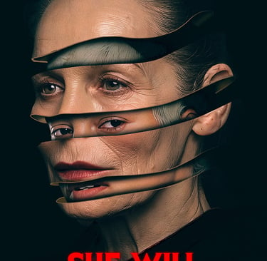
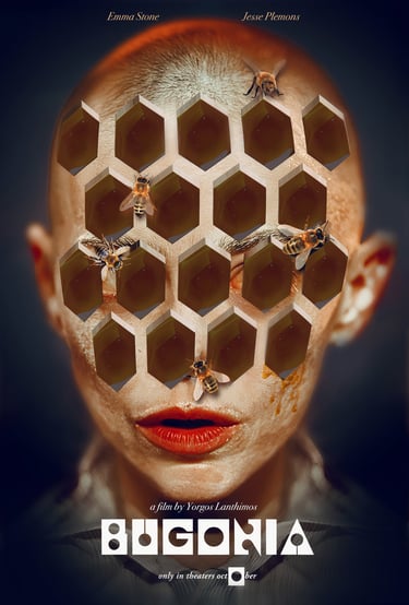
Every Horror Film Deserves Its Own Visual Identity
One reason I enjoy designing key art for independent horror filmmakers is that no two projects are alike.
Limited budgets often inspire the most original ideas. Every production has its own tone, audience, and marketing challenge, which means every poster deserves its own creative solution rather than a formula.
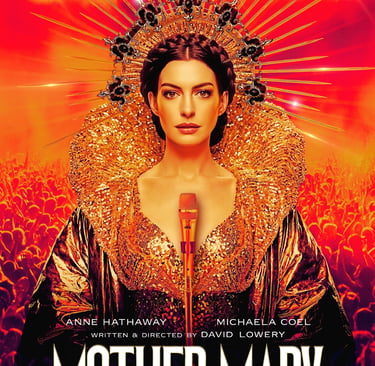
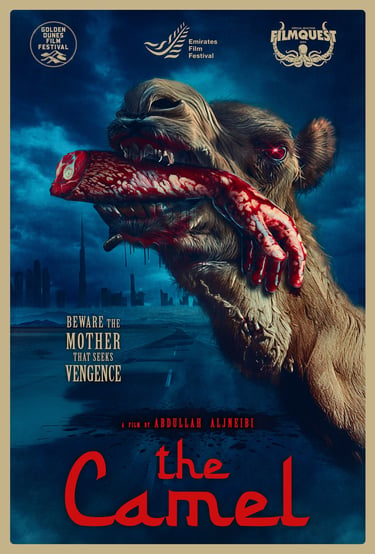
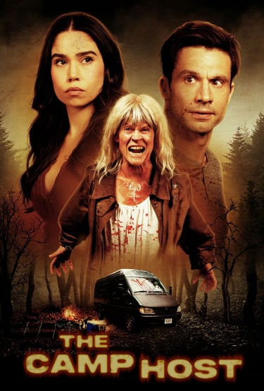
Throughout the case studies below, you'll see how different approaches to independent horror movie poster design can successfully market psychological horror, slasher films, supernatural stories, and surreal cinema while remaining true to each filmmaker's unique vision.
Because the best horror posters don't imitate what's already been done.
They create anticipation for something audiences haven't experienced yet.
Psychological. Slasher. Supernatural. Grindhouse. Surreal. Each speaks a different visual language, and each attracts a different audience. Great independent horror movie poster design begins by understanding those differences. The most successful posters aren't created by following horror trends—they're created by identifying what makes your film unique and translating that experience into a single unforgettable image.
To view original independent movie poster designs, click here: https://bigpictureco.net/independent-film-posters-portfolio
To see just how reasonable our pricing is, click here: https://bigpictureco.net/indie-film-poster-design-checkout
Creative agency for independent film marketing and movie poster design.
Impactful Collaborative Design
email: steven@bigpictureco.net
© 2025. All rights reserved.