5 Poster Design Mistakes Indie Filmmakers Should Avoid
Why Most Indie Movie Poster Suck
2 min read


Indie filmmakers often have limited budgets, making a compelling movie poster even more crucial for attracting attention and showcasing the film's essence. Here are 5 common mistakes to avoid:
Cluttering the poster with too much information: A cluttered poster with too much text or too many images can overwhelm the viewer and make it difficult to grasp the film's message.
Solution: Prioritize clarity and focus on a single, strong visual concept or a concise, impactful tagline, allowing ample use of white space to enhance readability and create visual harmony.
Using generic or low-quality visuals: Being forced to use Low-resolution or pixelated visuals can also damage the poster's professionalism and create a negative impression. With the poster being an after thought, you set yourself up for an uphill battle.
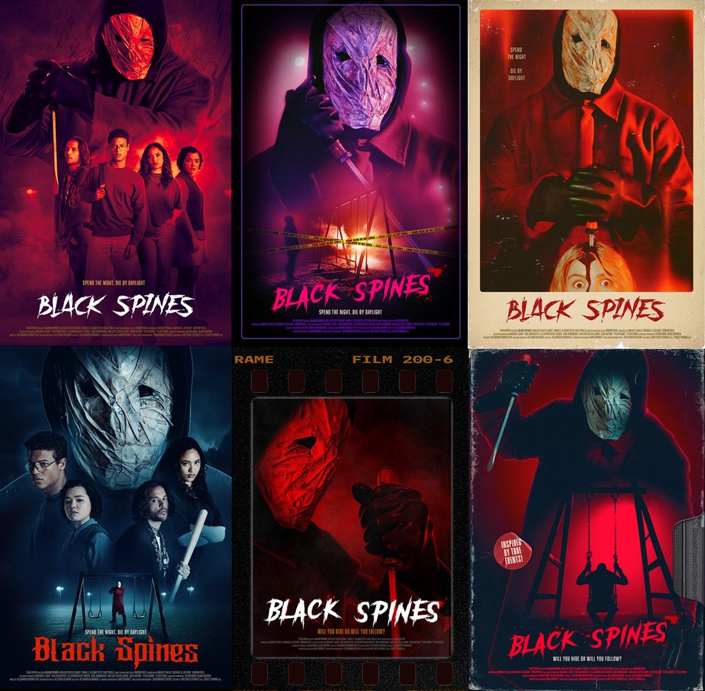
Solution: Invest in high-quality, original photography, illustrations, or graphics that accurately represent the film's genre, mood, and themes. Use high-resolution images that will maintain clarity even when resized for different platforms. Do a photo shoot of your actors on set while they are in make-up, wardrobe, and while in character. Film sets are hurry up and wait. Use that time to take photos of your actors and think "film poster" in your composition. Meaning think vertical, not horizontal.
Inconsistent typography and color palettes: Using a chaotic mix of fonts or clashing colors can be distracting and undermine the poster's aesthetic appeal. It can also make the poster difficult to read and comprehend.
Solution: Choose 2-3 legible and complementary fonts that align with the film's tone and style. Similarly, develop a cohesive color scheme that reflects the film's genre and evokes the desired emotional response, ensuring ample contrast for readability.
BONUS
Neglecting a clear visual hierarchy: Failing to establish a visual hierarchy can leave viewers feeling lost and unable to determine the most important elements on the poster.
Solution: Guide the viewer's eye by prioritizing key information like the film's title or focal image and strategically placing other elements, like the tagline or credits, to create a natural flow.
Not considering context and audience: A poster designed solely for print might not translate well to digital platforms, and a poster that resonates with one target audience may not appeal to another.
Solution: Design with versatility in mind, ensuring the poster works across various formats and sizes (print, digital, social media, etc.) Research and know your target audience and tailor the visuals, colors, and fonts to their preferences and expectations.
In short, plan on your film marketing while shooting your film. Photography of your actors while they are in make up, wardrobe and in character while on set saves time and will provide your film poster designer with the assets needed to create the best poster possible. Actors go off to shoot a different film in a different state, or cut their hair or put on weight after some time. This leads to unavailability and a lack of continuity for your movie poster. Photograph them when you can, while you can. Remember to shoot background / Plate images. Photograph important props and locations. If you are shooting a haunted house film, make the house a star and photograph it wide angle. Doing an action film with a hot rod? Photograph the hero car from all the best angles.
